The Populi user forum

Ever since we launched Populi, we've included customer support free with every pricing plan. Our schools get help via email, phone, and the Knowledge Base starting the day they sign up and every day following. We've always wanted to make it easy to get answers about Populi.

But some questions come our way that are a bit beyond what we're fit to answer. What's the best way to use Quickbooks for a non-profit? How do you handle access for accreditation staff? What's your policy for online course attendance? And so on. These are questions not so much about Populi as they are about the best way to run your school (and how Populi fits into that). On those matters, we like to defer to the experts: other users. Among our hundreds of customers, we have schools with a wide variety of shapes, sizes, and missions—and, we're sure, someone who has puzzled through your very problem and now has wisdom to share.

You can seek out that wisdom—and share your own—on the Populi User Forum. The Forum lets our users pose questions about best practices, school policies, workflow ideas, and so on—basically, anything having to do with running your school (including how to use Populi to make that happen). We encourage you to get on the Forum; a simple way to keep an eye on it is to subscribe to email updates. These will alert you to new topics, comments, and replies. Here's how to subscribe:

1. Go to the Knowledge Base

Click the orange help button in the upper right corner of Populi. Or, go to Populi Support and log in with your regular Populi login credentials and your school's Populi URL.

2. Go to the User Forum

In the right column of the Populi Support landing page, you'll see a list of Forums. Click User Forums.
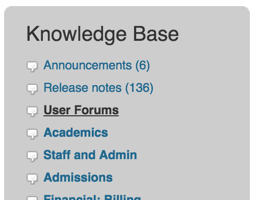
You'll then see links to the User Forum and the Feature Request Forum. Click the User Forum heading.

3. Subscribe!

Near the top of the screen, you'll see a subscribe link. Click it, and you'll be subscribed—that's it! Now, whenever someone posts or updates a new topic or comment, you'll receive a message about it at the email address marked Primary on your Populi profile.

Of course, everyone here is keeping an eye on the User Forum, too. We think it's a great opportunity for our users to help each other out and learn more about making Populi do the most for your school.

Financial aid workflow updates

Our new financial release gives Financial Aid its own General Settings section and introduces some new, more flexible workflows. Here's a look:

Refunds

A new setting now lets Student Billing and Financial Admin users refund financial aid to students. When you check Yes on the new setting, the Refund to Student workflow is folded in under your options in the new Refund Credit Balance workflow on Profile > Financial > Dashboard. An additional new setting lets you configure your Aid Refund Policy—if you need to combine aid refunds with regular credit balance refunds, for example, you now have that option.

The new setting is a one-way, opt-in setting; once you enable it, you're upgraded to the new, improved workflow (for keeps!). It's a considerable improvement to the old batch workflow, and it will definitely take some work off your Financial Aid department's desk. Read about it in the Populi Knowledge Base.

Refund Credit Balance

With all this talk of a new Refund Credit Balance workflow, we thought it'd be helpful to tell you what we're talking about.

Formerly, non-aid refunds to students were handled as an outgoing payment. There were some problems with this. For starters, most folks didn't think to look for the refund workflow under the Record Payment option. It also only let you refund regular payments—it didn't touch aid refunds to students, which are handled by many schools' student billing departments.

The new Refund Credit Balance option now appears whenever the student has something refundable—an unapplied payment or credit, or unapplied aid (if you've updated the aforementioned setting). The steps are just the same as the old workflow, with numerous provisions for the Aid Refund Policy setting. It's more intuitive, and what's more, the option only appears in the actions menu if there's something refundable on the student's account. It's an improvement not just for Financial Aid, but your Student Billing office as well. Read more about the new Refund Credit Balance workflow.

Batch workflow order

The Disbursement batch workflow setting lets you specify which comes first: disbursing aid to students or drawing down the funds from the aid source. If your school is required to disburse-then-draw-down for Federal aid awards, you can now set up your batch workflow to follow the same steps in the same order you do.

Better fee rules and other financial improvements

Fee rules let you set up conditions that automatically trigger a fee when a student enrolls in a course. You can target them at things like enrollments, audits, campuses, custom info, and so on.

Handy as they are, fee rules haven't always proved flexible enough to target complex situations. It was pretty difficult, for example, to make a fee trigger when students in the Graduate program enrolled in LIT576 at either the Springfield Campus or the Urbana Campus—such either/or situations required multiple fees with different rules.

Our new fee rules (just released last night!) handle these situations with aplomb. Rules now exist within rule groups; you can have multiple rule groups for each fee. Rule groups include an "any/all" selector that lets you specify your conditions with greater clarity. If you use multiple rule groups, you can easily set up conditions that bill students who "all fit this situation and either this or that other situation". That means it's now simple to set up a fee that triggers when an Undergraduate student enrolls in 1 to 18 credits at either the Portland Campus or the Online Campus (like the above image).

In addition to rule groups, we've added new rules that let you distinguish between all of a student's enrolled units and those enrolled units that match your other conditions. To learn more, check out our detailed Knowledge Base article that describes how fees work.

Here are some of the other financial improvements we've released in the recent weeks and months...

Improved financial dashboard summary

The student's financial dashboard summary is now headlined by a big fat Make a Payment button that shows the student's amount due (plus any overdue amount). Upcoming payment due dates (whether for invoices or payment plans) are clearly lined out together with any pending financial aid payments.

Invoice due dates

Lots of people asked for this: you can now edit invoice due dates! Just go to the invoice's info page and click the pencil next to the due date in the right column.

Recurring payment management

Last May we added the ability to set up recurring donations and payments. A recent updated gives you more options for managing those payments. You can now change the amount, schedule, and payment details on both the payer's profile and the Recurring Payments/Donations reports.

Academic Auditor role, plus some other new academic features

We're pleased to announce the release of the Academic Auditor role. Academic Auditor gives the user read-only access to all academic information in Populi—everything from student records to reports to Advising to the course catalog. An Academic Admin can give the new role to anyone they wish, and you can read about its permissions in the Knowledge Base. Our users have been clamoring for a role with these abilities, and we're really happy to get it out to everyone.


A couple other notable academic features have made it out into the wild the past few weeks. First, School Closures! You can now add holidays and closures to your Academic Years. When you do so, Populi will automatically block out course meeting times for those dates. Likewise, you can also add Library Closures in Library > Calendar—these closures postpone resource due dates and other time-sensitive Library features.


The other one: assignments and attendance for auditing students. Some schools let their auditors receive grades and feedback on coursework, and others like to include them when taking attendance. With the new Auditors setting (in Course > Info), you can now set your courses to allow Faculty to give assignment grades and take attendance for Auditors.

Advising

We're pleased to announce Populi's new Advising features. They include a new report, new advising workflows, and an academic warning system. Let's have a look...

Academic flags

The new academic warning system lets you set up thresholds for red, yellow, and green flags based on course attendance and grades. For example, if a student has three or more consecutive absences, he'll get a red flag. If his average assignment score from the past 30 days is in the mid-70's, he'll get a yellow flag. If in the next 30 days he pulls that average up to 90%, the yellow flag will flip to green. Advisors can ask Populi to send an email when one of their students gets a red or yellow flag.

The new Advising tab

Advisor activity, which used to be focused on the Profile > Advisor tab, now starts in the new Advising tab. Advising includes the Advised Students report and Settings, where you can set up the new academic warning system. Academic Admins, Registrars, and Advisors can all access the Advising tab. The Advised Students report gathers relevant academic information about your students:

  • If the student has any academic flags, you'll see the most serious one next to his name.
  • 30 day assignment grades lets you see at a glance how the student is faring on assignments graded in the past month.
  • Last Attendance shows you the last time the student was present for a class meeting time.
  • If the student is under academic discipline or has a registration lock, you'll see that here, too.
  • The Actions menu lets you add/remove Advisors, apply/remove registration locks, and email or export the students shown on the report.
  • Click the student's name to see the new student advising view.
Student advising view

The student advising view includes an enhanced transcript tool and a summary of the student's academic flags.

  • In the transcript, you can click the attendance percentage or the grade to see a detailed graph of the student's class attendance and assignment grades.
  • You can also click the course name to see the new Student Course Summary page.
  • Review and resolve academic flags.
  • The Actions menu lets you manage registration locks and export detailed attendance stats for the student.
Student course summary

The student course summary is accessed through the course roster. It lets faculty, advisors, and registrars drill down into the student's grades and attendance and manage the student's flags for that course.

  • The Assignments tab graphs the student's assignment grades and compares them with the standard deviation derived from all of the course's students.
  • The Attendance tab, likewise, graphs the student's attendance stats and lets you compare them with the rest of the class.
  • You can take a closer look at any assignment or meeting time and change the grades or attendance status.
  • The flagging tool lets you manually-add warning flags to the student, assign them to the advisor, and resolve them once the trouble has been sorted out.
Little changes

Together with the big-picture features, you'll notice a few more options for adding registration locks, adding and removing Advisors, and contacting students. We think these new tools will really help your Advisors guide your students through their time at your school, and we're happy to get them out to you. Learn more about the ins-and-outs of the new stuff in the Knowledge Base.

Efficiency and expectations

As far as I can make out, "efficiency" means that we ought to discover everything about a machine except what it is for. - G.K. Chesterton


Aurora Bedford writes about the phenomenon of "more efficient" website workflows that nonetheless flummox users who are used to more complex, "inefficient" versions of the same tasks:

...it’s common for many websites and applications to try to reduce the amount of steps—often, clicks—that a user must do in order to complete a task. However, interaction cost is more than just the number of clicks (or other physical actions)—it also involves mental effort. There are times when focusing purely on the number of steps actually backfires: instances when users are so accustomed to the “inefficient” process that streamlining it is perplexing and breaks the task flow.

Bedford recounts the example of an Email Settings form with no Save button:

What is missing from this otherwise fairly standard form? There is no Save button! How do we apply our changes so they are saved in the system? Computer-savvy readers may realize that the form is likely saving any changes whilst they are made, thus gaining efficiency by not requiring an extra save button press. However, most users are not this savvy, and even the savviest amongst us are more used to the pattern of having a Save or Submit button at the end of a form. This is an excellent example of how even the smallest deviation from a standard can cause confusion and increase cognitive load.

I recently encountered this myself when trying to post an image to a blog hosted by Squarespace.

First, I went to the New Post editor:

The title was easy enough to place. And if I wanted to write, I would just click in that text area with the two gray blobs and start typing. But how would I post an image? I hovered over the text area:

Hm. Okay. None of those look like the usual add media options. See, I'm used to Wordpress; it's far and away the most common blogging tool out there (it runs this blog, for one). And for all of its various irritations and flaws, its WYSIWYG editor is unambiguous when it comes to uploading media:

I scrutinized the Squarespace interface, even going into the blog's settings to see if I needed to somehow enable images. Nothing worked. Finally, I clicked the Help link and searched their articles for How to post an image. This article enlightened me. Turns out I needed to start by clicking one of those gray blobs:

From that point on, posting the image was simple and straightforward. But to get to that point, I had to jettison everything I know about adding an image to a blog post and learn how to use an idiosyncratic interface element I've never seen anywhere else.

Sure enough...

...users spend most of their time on other sites... When reaching your site, they expect it to function in the same way as on those other sites—any slight deviation from their norm snaps them out of autopilot and forces them to think and try to find an action that matches this novel situation.

How does this dynamic work with Populi? What expectations do people bring to our software? Here are a few things we've learned and observed...

  • Being web-based, we can build on the ready-made language and conventions of web design to help new users intuit how to use Populi. There's a lot about our service that requires no explanation.
  • For many schools, Populi replaced other types of software. Perhaps a spreadsheet program from a productivity suite. Maybe a homegrown database. Or another program repurposed for running a college. When a school leaves such a program behind, it's a pretty clean break: users don't expect a web app to behave like Excel.
  • Other schools came to Populi after years of using terrible purpose-built college software. Some systems didn't do as much. Other systems did a lot "more". Some were just unreliable and incompetent. Each one inflicted a peculiar kind of suffering that drove the school into our embrace. This provided another clean break: as long as Populi isn't anything like that last system, we're good!
  • We've run into this phenomenon with Library. Populi Library is built on the web-capable Dublin Core, but most libraries (and their software) traffic in the more established, but creaky, MaRC format.  We've designed our search for simplicity; most library software gives you every search option, ever, on one screen. These, among other differences, have coaxed us into a different approach towards Library improvements than we initially envisioned.
  • Nothing exposes this like a feature update. Our customers use Populi day-in, day-out, so new features invariably break old habits. For example, when the Admissions overhaul improved Populi in every way. But several users told us they preferred the old version—simply because they were used to it! Better as it was, the Admissions rewrite nonetheless caused the cognitive strain Bedford describes. Something similar happened when we rewrote Courses, and even when we changed the old search field to a "hidden" search tab. It wasn't that these features were a devolution; new users had no problem picking them up. But for those who had gotten used to the old way, the "improvements" didn't improve their workday (initially, at any rate).

Good software is built on a basic empathy for the user. Usually that means that we reduce complexity and pare things down to their simplest, most efficient expression. But people are complex, and we can't just mechanically assume that software simplicity begets efficiency. Hopefully, we'll always keep learning this lesson.

After all, software is for humans, and humans are not for software.